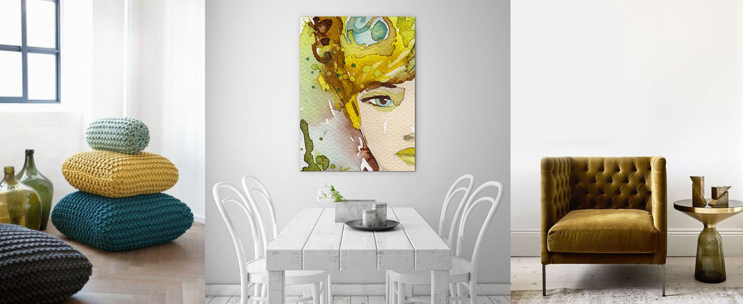
Our favourite new shade for home decor is chartreuse colour. But what exactly is chartreuse? Although there are different shades available, the colour chartreuse is halfway between yellow and green. A bright, cheery colour, it can be the perfect addition for any home looking to add some pop and style. While it may seem like a difficult choice to work with, don’t be intimidated! Following some basic tips and tricks can help you bring this beautiful colour into your home.
Tips and tricks:
- Chartreuse makes a great accent colour, such as a feature wall, furniture, or accessories.
- Don’t be afraid to use it as a main wall colour for a stand out feature.
- Check out different shades for different effects. A pale shade of chartreuse colour works well with traditional designs or cool patterns, while a bolder shade can make a fantastic design statement.
- Try it out first and make sure to take lighting in to account. Proper lighting will showcase the colour chartreuse, while poor lighting can wash it out or bring out the wrong undertones. It can also help to see how others have used the colour in their designs.
While chartreuse colour is very versatile, there are definitely some combinations that work better than others and the overall look will change depending on your choices.
Colour combos to try:
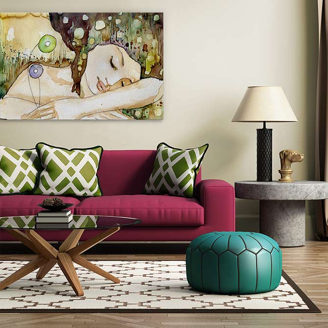
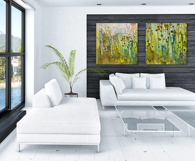
- One of the best colours to pair with chartreuse is grey. Choose a darker grey for a warmer overall look.
- For a cool, neutral look with a more traditional feel, use white with chartreuse. This will tone down the vibrancy and offer a fresh, light environment.
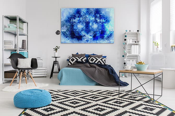
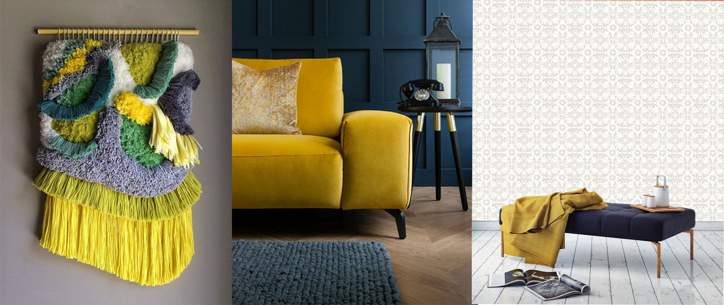
- One of the hottest current trends is chartreuse and deep blues. A chartreuse sofa against a dark blue wall or vice versa creates a bold, dramatic look.
- Lavender and chartreuse together are the perfect look for a bedroom or anywhere that you are looking to achieve a calm and soothing feel.
- Chartreuse mixed with reds or oranges creates a bright, bold look, for a fun and creative environment.
Because chartreuse colour sits between green and yellow, it offers the benefits of both, representing the calming, happy, natural feel you get from the colour green, while also offering the enthusiasm and happiness that comes from the colour yellow. Its versatility allows it to be used in so many ways and whether it’s just a splash, or an entire wave, chartreuse is the perfect addition to any home decor!
Chartreuse colour in the kitchen
If you’re not ready to redo your bedroom or lounge you can add some chartreuse colour to your kitchen for a fresh feel. Adding in kitchen appliances, crockery, cookware or bright napery can give your kitchen a nice little pop of colour without committing to big ticket items or getting out the paint brush— especially if you’re renting.
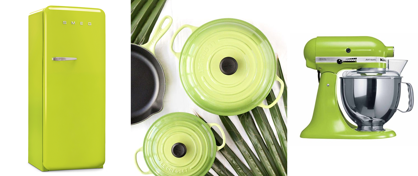
Fridge – Smeg / Cookware – Le Creuset / Stand up mixer – KitchenAid
It’s a bold colour that is not for everyone but it’s definitely worth a little play. You never know, it may just brighten up your day. If bright is your thing, take a look at our summer art collection for extra inspiration.