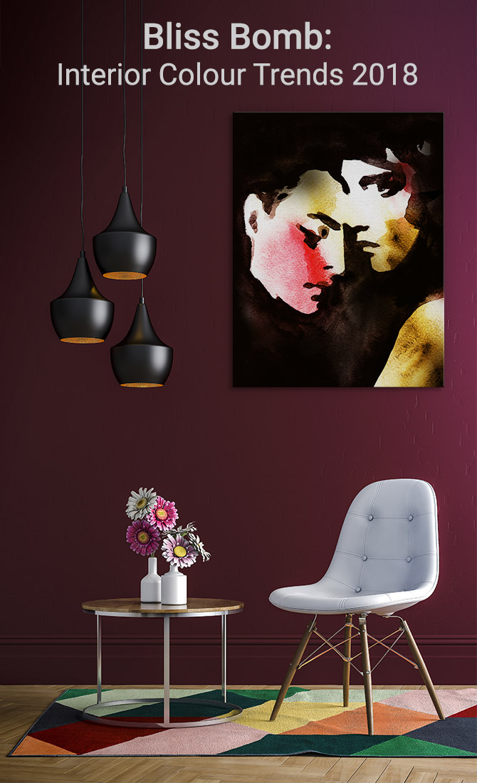
As 2017 draws to a close and we start reflecting on a year gone by, we felt it made sense to lead the shift as soon as possible into a new year, exciting your visual senses with interior colour trends 2018.
The good news is that, in terms of interior design, 2018 is an absolute bliss bomb. Inspired by Dulux Colour Trends, we’ve put together a revolutionary collection of colour palettes focused on balance.
2017 flew by and showed no signs of slowing down. The good news is that 2018 is all about shifting out of the fast lane and letting simplicity take hold. The Dulux Colour Forecast 2018 “harnesses the power of colour to balance the complex challenges of everyday life.”
Love the sound of that as much as we do? Join us as we explore the four futures of interior colours: Essential, Escapade, Reflect and Kinship.
Discover a world of balance with inspiring colours that “bring the future of colour to life”.
Essential
The ‘Essential’ colour palette is all about slowing things down. We’re hyper-connected and surrounded by technology 24/7, so these colours for the home are all about providing a remedy for that state of being.
Colours like Terrace White, Elusive Blue and Mornington Half will help you embrace a more authentic lifestyle – something so, well, essential when you’re in the comfort of your own home.
2018’s Essential colours aren’t pretentious or glittery; they’re about realising that wealth and happiness comes from the more simple things in life.
The colours are all about nurturing the soul, covering a palette of warm leathers, splashes of blue and beautiful rusted tones.
1. Terrace White
AUTHENTIC: Terrace White is warm in its simplicity, a wonderful new neutral to remedy a fast-paced world.
2. Elusive Blue
NURTURING: Elusive Blue, when combined with Terrace White and Mornington Half, provides a spirit of happiness without the glitter.
3. Mornington Half
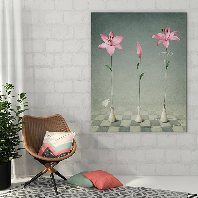
BLISS: You won’t be able to resist Mornington Half in 2018 as its pale pink hue fills your soul with calm to counter the chaos.
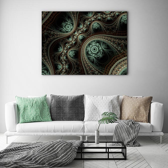
4. Essential In Action
From The Interiors Addict
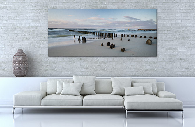
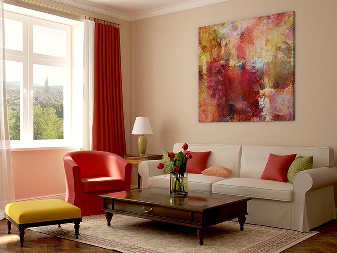
COMFORT: Ease into the day with a pop of Noble Knight blue, a refined addition to this Essential colour palette in action, complementing the warm neutrals: Mornington Half and Flooded Gum.
Escapade
With globalisation, our borders are fast becoming closer together with cheap flights and affordable accommodation enabling fun around every corner.
The ‘Escapade’ colour palette is all about bringing that sense of adventure home. Bring that holiday home with this dreamy colour palette inspired by ultimate travel destinations.
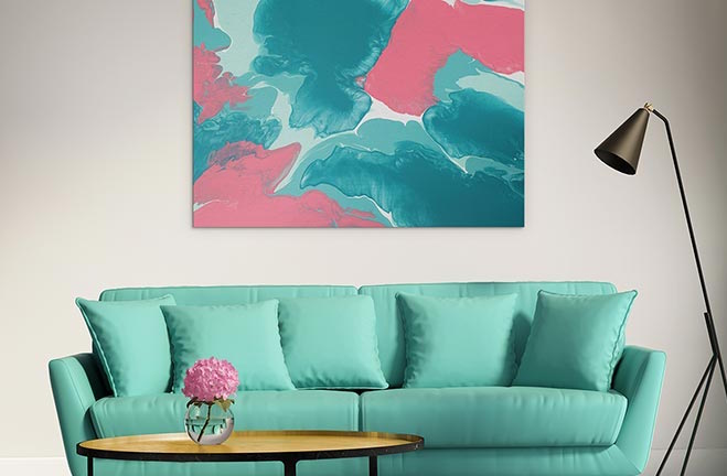
The vibe of the tropics is strong in 2018 with a range of lively teals, greens and pinks. Colours with names like Bondi, Blue Sail, Tangerine Flake and Bombay Pink paint a picture of paradise without even needing to know the detail.
The palette isn’t all bright pops of rainbows, sunshine and lollipops. To contrast, Escapade also features some chill out colours like Cuticle Pink, Friends and Soft Fresco, all featured below. Or as Dulux describes, it is an ‘interplay of pattern and colour’ that is ‘at once nostalgic and futuristic’.
When travelling with Escapade, luxury is whatever you make of it. Ready to hop on board?
5. Cuticle Pink
LUXURY: A precious pink like Cuticle Pink delightfully combines with Soft Fresco and Tangerine Flake touches.
6. Friends
DREAMY: Bring the inspired outside world in with a powdery pink Friends colour wall plus a touch of Soft Fresco and Pale Mustard.
7. Soft Fresco
CHILL OUT: Soft Fresco is the ultimate chill out colour of 2018, somehow embracing the nostalgia of yesterday with the promise of tomorrow featured here alongside Purple Balance and Cuticle Pink.
Reflect
We never thought we’d say it: heritage colours are back in 2018! But before you start getting too worried, they are back with a twist.
This ‘Reflect’ colour palette is all about paying homage to the past, taking the best moments in design history and refashioning them to suit more contemporary spaces. Phew!
So while this palette features classic colours like ‘Bronze Essence’ and ‘Forbidden Forest’ it’s less about revisiting old century stylings and more about what you do with them in a modern context. For example, the palette also includes bold colours like Amazon Queen and Rose Pink Villa and urban touches like Stainless Steel.
Let’s just say it’s a dash of the 1930s and a splash of the 1960s mixed together with a drop of the 21st Century to create something truly elegant, opulent and tasteful.
8. Rose Pink Villa
OPULENT: Move over stone grey neutrals, Rose Pink Villa is the epitome of luxury in 2018 combined with metallics and other moody hues from the Reflect colour palette.
9. Goyder Green
TWIST OF GREEN: One of five greens in the Reflect colour chart, Goyder Green is a softer powdery choice that oozes elegance.
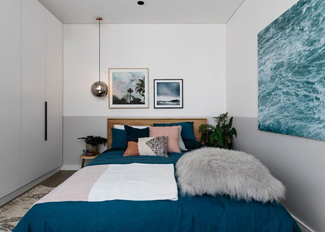
10. Reflect In Action #1
From Coco Kelley
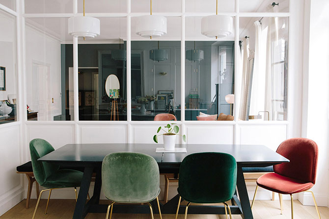
BLAST FROM THE PAST: Here the classic furnishings of the 1960s as featured in the Reflect colour palette cleverly complement this light, bright contemporary decor.
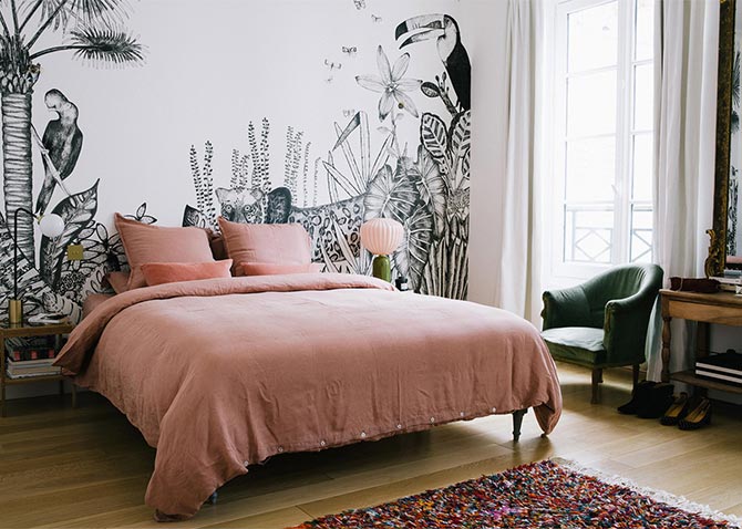
11. Reflect In Action #2
From Katrina Lee Chambers
TWIST OF STYLE: This gorgeous boho decor highlights how gorgeous classic colours can be when combined with contemporary furnishings.
Kinship
‘Kinship’ is the most sentimental of the Dulux colour palettes for 2018 providing leadership in highlighting that a better, kinder, more compassionate world is possible.
The folk at Dulux describe it as a ‘gentle revolution’ and they present it to all of us through the use of a colour palette that is intimate, warm and positive.
They suggest it’s time to tap out of the fake news and click bait headlines and revive long held traditions. The colours are also about embracing cultural harmony, but inspired by traditional crafts.
As a result the palette features soft, safe neutrals and rich earthy hues. For Australians, the palette is reminiscent of our outback landscape but minus the harshness.
12. Ruski
INTIMATE: The only blue in the Kinship colour palette, Ruski drowns out the negative vibes.
13. Outrageous Red
POSITIVE SPIRIT: Outrageous Red combines with Red Ochre, Herbalist and Beige Artefacts for a stunning example of the Kinship colour palette at work.
14. Maiko
SAFE: The pinky, peachy hue of Maiko makes it the perfect neutral and the perfect accent, the choice is all yours.
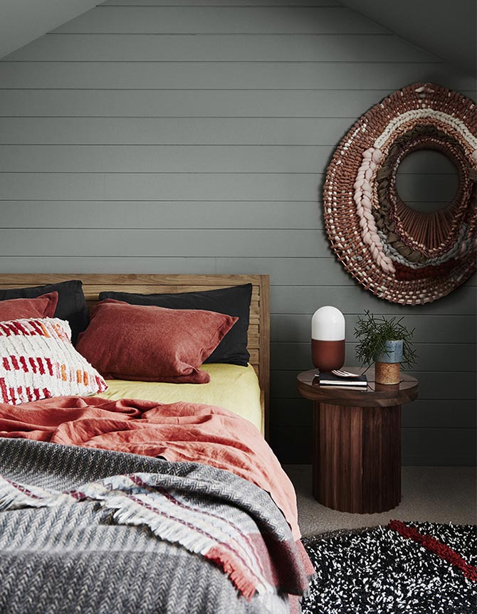
15. Kinship
From Coco Kelley
REVOLUTIONARY: Channel compassion in 2018 with colours and stylings that will ignite our sense of community – very gently.